Configuring Attributes
Attribute Types
When you create an attribute, you start by selecting the attribute's type. The type determines what kind of data value the attribute field will accept and store (e.g. numbers, text, dates, etc.). Each type is also associated with a specific user interface (UI) element. Users use this UI element to set a value for the attribute when they create or edit an activity.
The following attribute types are available:
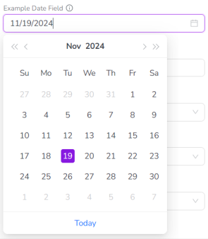
Date
Data Type: Single date values in the format MM/DD/YYYY.
UI Element: Date picker that displays a calendar. Users can click on a date in the calendar to set the date value, or enter it manually into the input field.
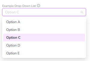
Drop-Down List
Data Type: Predefined options.
UI Element: Drop-down list that displays the predefined options. Users can click on a single option in the list to select it. Users can also type a keyword into the field to filter the options list.
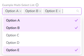
Multi-Select List
Data Type: Predefined options, optionally with user-customizable percentages.
UI Element: Drop-down list that displays the predefined options. Users can click on one or multiple options in the list to select them. Users can also type a keyword into the field to filter the options list.
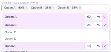
If the percentage allocation feature is enabled, users can also enter a percentage value for each selected option (see Percentage Allocation Setting for more information).
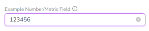
Number or Metric
Data Type: Numeric values.
UI Element: Input field that accepts values containing only numeric characters (0-9). Values that include non-numeric characters are rejected.
Rich Text
Data Type: Formatted rich text (including emoji and other special character sets).
UI Element: Large text input field with a formatting control bar, similar to a What You See Is What You Get (WYSIWIG) editor. Supported formatting options:
-
Text styles:
-
Normal (paragraph)
-
Headings (h1 - h3)
-
Hyperlink (clickable)
-
Blockquote
-
-
Text formatting:
-
Bold
-
Italic
-
Underline
-
-
List styles:
-
Bullet
-
Numbered
-
Note
The following limitations apply specifically to Rich Text attributes:
-
When you view the Details Panel of an activity whose parent activity has one or more Rich Text attributes, these attributes are not included in the Show inherited attributes section which displays attributes (and their values) inherited from the parent activity.
-
Rich Text attributes are not included in any Uptempo reporting functionality.
-
Rich Text attributes are not support for filtering and sorting activities, or for Outbound Actions.
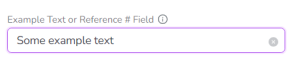
Text or Reference #
Data Type: Alphanumeric values.
UI Element: Input field that accepts values containing any combination of letter characters, number characters, and special characters.
Note:
The Text or Reference # attribute type supports characters from the Unicode Basic Multilingual Plane. This includes characters for all modern languages, such as diacritics (e.g. umlauts, accents, etc.), logographs (e.g. characters for Chinese, Japanese, Korean, etc.), and various other symbols.
Attribute Settings
You can configure an attribute's settings when you create a new attribute, or when you edit an existing attribute.
For instructions on how to configure an attribute's settings, see Creating an Attribute and Editing an Attribute.
Basic Settings
All attribute types have the following basic settings:
-
Location (required): Sets where the attribute will be displayed.
-
Always set to Details Panel by default. This is currently the only available location for attributes, so the setting can't be changed.
-
-
Type (required): Sets the attribute type.
-
Set during attribute creation, and can't be changed later.
-
-
Name (required): Sets the display name of the attribute. This name is also used as the label for the attribute when a user is creating or editing an activity.
-
By default, this is set to "New Field" for all newly created attributes.
-
-
Help Text (optional): Sets the text that is displayed in the attribute's tooltip.
-
If configured, a tooltip icon
 is displayed next to the attribute label, which reveals the tooltip text on hover:
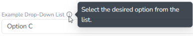
-
If not configured, the tooltip icon is not displayed.
-
Note:
All attribute types also display a Date Range setting. This setting is currently not used in the system. As a result, we recommend that you do not configure it for any attribute.
List Options
Attributes with the types Drop-down list and Multi-select list have additional settings. These settings configure the predefined set of options that a user can select from the list.
-
You can add list options, rename them and change their display order
-
You can also manage list options in bulk with the export and import features
-
You can deactivate list options
-
You can delete list options (and replace them with other list options on activities where they are in use)
 Add and Manage List Options Individually
To add, rename, or change the display order of list options for a Drop-down list or Multi-select list attribute, follow these steps:
-
When you create or edit a Drop-down list or Multi-select list attribute, click Edit Options in the Attribute Details panel:
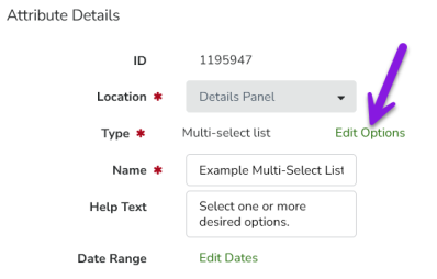
The Edit Options dialog opens.
Note
For instructions on how to create or edit an attribute, see Creating an Attribute and Editing an Attribute.
-
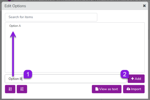
Type the name for an option into the text box and click + Add. The option is added to the list of options:
-
Repeat the previous step to add additional options.
-
Optional: You can also rename and change the sort order of list options:
-
To rename an option: Hold the pointer over the list option and click
 Edit, then type the new name into the field. Click anywhere outside the field to save the new name.
 -
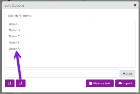
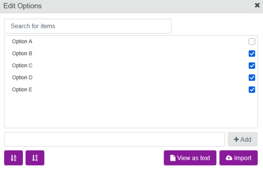
To change the alphabetical sort order of the options: Click Sort A-Z or Sort Z-A:
-
When you have finished configuring the list options, close the Edit Options dialog. Your changes are saved automatically, and will take effect immediately.
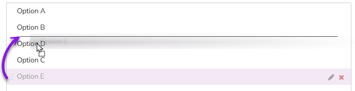
To manually set the sort order of the options: Drag the list option you want to move to the place in the order where you want it to be displayed (a horizontal line shows where in the order the option will be placed):
Add List Options In Bulk
You can also import list options to create them in bulk (rather than individually). The import feature is designed to be used together with the export feature, which lets you copy an existing list of options from any list-type attribute.
To add list options in bulk using the export and import features, follow these steps:
-
Open the Attribute Details panel for the Drop-down list or Multi-select list attribute from which you want to export (copy) the list options.
Note
For instructions on how to open the Attribute Details panel of an attribute, see Creating an Attribute and Editing an Attribute.
-
Click Edit Options:
-
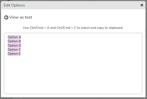
In the Edit Options dialog that appears, click View as text. The View as text dialog appears.
-
The current list options for the attribute are displayed in plain text, with each option on a separate line. Select all of the options and copy them to the clipboard.
-
Close the Edit Options dialog.
-
In the list of attributes, find the Drop-down list or Multi-select list attribute to which you want to import the list options you just copied. Open its Attribute Details panel, then click Edit Options.
-
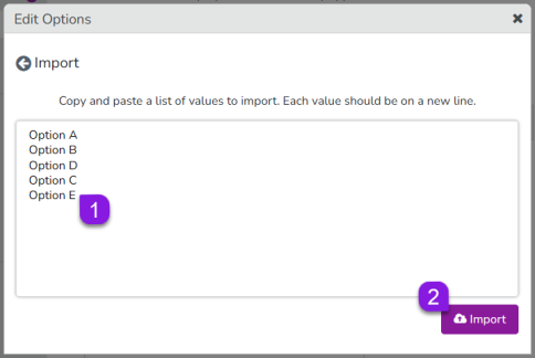
In the Edit Options dialog that appears, click Import. The Import dialog appears.
-
Click into the text field and paste in the values you copied from the other attribute, then click Import. The Import dialog closes, and you are returned to the Edit Options dialog.
-
In the Edit Options dialog, the imported list options now appear in the list of options configured for the attribute. You can now make any changes to the options as needed, such as changing the order or renaming options.
Note: If the attribute already had existing list options before the import, the new list options will be added to the end of the list.
-
When you have finished configuring the list options, close the Edit Options dialog. Your changes are saved automatically, and will take effect immediately.
Note:
You can also use the import feature by itself to manually create multiple list options quickly. To do this, skip the export step and go directly to the target attribute. Instead of pasting the list options you want to add into the Import field, just type them into the field directly (make sure to put each list option on a separate line).
Deactivate List Options
When you deactivate a list option, it will:
-
No longer be selectable on any activity where the attribute is used
-
Remain in place as the selected attribute value on any activity where it was previously set for historical reference
If needed, you can also reactivate deactivated list options later.
To deactivate list options for a Drop-down list or Multi-select list attribute, follow these steps:
-
Open the Attribute Details panel of the Drop-down list or Multi-select list attribute for which you want to deactivate list options, and click Edit Options:
The Edit Options dialog opens.
Note
For instructions on how to open the Attribute Details panel of an attribute, see Creating an Attribute and Editing an Attribute.
-
To deactivate a list option, deselect its checkbox in the Edit Options dialog:
-
Optional: Repeat the previous step to deactivate additional list options.
-
When you have finished deactivating list options, close the Edit Options dialog. Your changes are saved automatically, and will take effect immediately.
Note
You can also re-activate previously deactivated list options. To do this, select the checkbox of a deselected list option in the Edit Options dialog.
Delete (and Replace) List Options
When you delete a list option, it will:
-
No longer be selectable on any activity where the attribute is used
-
Not remain in place as the selected attribute value on any activity where it was previously set
If the deleted list option was not set on any activity, it will be deleted immediately.
If the deleted list option was set on at least one activity, and the attribute that the deleted list option belongs to is:
-
Not required on any activity type: You can optionally select a replacement list option to set on the affected activities. If you do not select a replacement list option, the attribute will have no value set on the affected activities.
-
Required for at least one activity type: You must select a replacement list option to set on the affected activities.
To delete list options for a Drop-down list or Multi-select list attribute, follow these steps:
-
Open the Attribute Details panel of the Drop-down list or Multi-select list attribute for which you want to delete list options, and click Edit Options:
The Edit Options dialog opens.
Note
For instructions on how to open the Attribute Details panel of an attribute, see Creating an Attribute and Editing an Attribute.
-
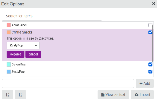
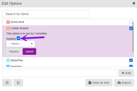
To remove a list option, hold the pointer over the list option and click
 Delete:
-
If the list option was not used on any activities, it will be deleted immediately.
-
If the list option is in use on any activities, use the menu to select another available list option as a replacement. Click Replace to delete the list option and set the selected replacement list option on the affected activities instead:
-
-
Optional: Repeat the previous step to delete additional list options.
-
When you have finished deleting list options, close the Edit Options dialog. Your changes are saved automatically, and will take effect immediately.
Note
If a list option is in use on activities, but the attribute is not required on any activity type, selecting a replacement list option is optional. In this case, you can deselect the Replace checkbox if you do not want to set a replacement list option:
Percentage Allocation
The attribute type Multi-select list has an additional setting to enable the percentage allocation feature. When this feature is enabled for a Multi-select list attribute, users can specify a percentage value for each of the options that they select from the list. You can use the percentage allocation feature for attributes where you want to record the relative weighting or contribution of each selection.
Example
Some example use cases for setting percentage values on multi-select attributes:
-
Quantify how much each selection contributes to an overall objective or target, e.g. how much a tactic contributes to different funnel stages
-
Specify how the overall value or quantity that the attribute represents should be split up between the selections, e.g. how to split up the total time spent between various actions
Functionality Notes
-
When percentage allocation is enabled for a Multi-select list attribute, the system initially sets the percentage values automatically:
-
As the user adds selections, the system calculates and adjusts the percentage value of each selection to maintain an equal distribution.
-
For example, if there are four selections, each will be automatically assigned a value of 25% (1/4 of 100%).
-
-
After making all selections, users can manually enter percentage values for each selection as needed:
-
The sum of all specified percentage values must always total exactly 100%.
-
If the sum of the percentage values totals more or less than 100%, the system will display an error message. Any changes to the selections or their percentage values will not be saved until the user adjusts the percentage values to total exactly 100%.
-
Users can enter percentage values as decimals, and can specify as many decimal places as they want. Decimal places are also taken into account for the requirement that all percentage values must total 100%: if a decimal percentage value is specified for one selection, at least one other selection must also have a decimal percentage value with the same number of decimal places to sum to a whole number.
-
Users can enter a value of 0% for any selection, including for multiple selections (provided the values of all selections still totals 100%).
-
-
After they are set, the percentage values are displayed beside the label of each selection wherever the attribute field is displayed (e.g. in an activity's Details Panel, or in Analytics and BI exports, etc.).
-
The percentage values for attribute selections can also be used by the Impact Modeler feature. For details, see Impact Modeler.
Enable or Disable Percentage Allocation on a Multi-Select List Attribute
You can turn the percentage allocation feature on or off for any new or existing attribute with the type Multi-select list.
To enable or disable the percentage allocation feature on an attribute, follow these steps:
-
When you create or edit a Multi-select list attribute (see Creating an Attribute and Editing an Attribute):
-
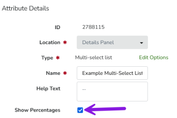
To turn percentage allocation on, select the Show Percentages checkbox in the Attribute Details panel
-
To turn percentage allocation off, clear the Show Percentages checkbox in the Attribute Details panel
Note:
If you turn off the percentage allocation feature for an attribute on which percentage values have already been set, this will not delete the percentage values. Instead, the percentage values will be hidden, and you can restore them at any time by re-enabling percentage allocation for the attribute.
-